You should follow some general best practices when writing for online readers to make sure that text and hyperlinks are accessible for all readers regardless of ability.
Links
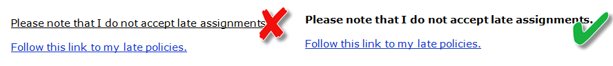
- Links should include meaningful text, so users understand the destination of the link.
- Links should make sense out of context since some screen readers, including JAWS, enables users to read just the links.
- Never use text such as “click here” or “read more” since this language is not descriptive.
- Avoid using web addresses; instead, type in meaningful text and hyperlink this text to the target location. If you think students will be printing a page, you can include the web address unlinked in parentheses, following the linked text, such as the University of Arkansas (http://uark.edu).

- Links should be underlined and lighter or darker than the main text. This allows users who are colorblind to find them more easily.
- Do not underline text if it is not a link since users with low vision or color blindness may have difficulty distinguishing this text from linked text.
Add Hyperlink in Word
To hyperlink text in Microsoft Word:
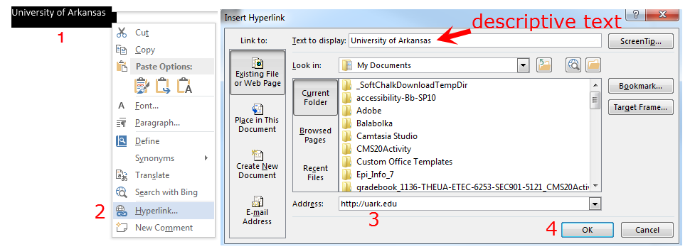
- Highlight the text
- Right-click and select “Hyperlink” (or select Hyperlink from the Insert ribbon)
- Paste the Web address in the “address” text area (note descriptive text at the top in the “Text to display” area)
- Select the OK button
Add Hyperlink in Blackboard Content Editor
To add a text link in the Blackboard content editor:
- Type in meaningful text and highlight the text.
- Select the link icon in the editor
- Follow prompts to add web address and save
Ordered and Unordered Lists
When creating numbered or bulleted lists, it is important to use the list tools in your word processing application or in Blackboard (as opposed to typing numbers on each line or adding a special character to designate a bullet). Using the proper tools will apply the appropriate underlying code that enables other programs and assistive technologies to understand that the content is presented as a list.
The method to apply an ordered (numbered) list or unordered (bulleted) list is similar in all applications. Place your cursor to the left of the item and select either the unordered (shows bullets with lines) or ordered list (shows numbers with links) icon.
Font Size
General Documents
Applications will save fonts in either relative or absolute font sizes. Relative font sizes (em, %, etc.) allow users to easily resize text and are preferable. However, if your application only provides absolute font sizes, body text should be approximately 12 points to ensure they are legible. Footnotes or endnotes should be a minimum of 9 points.
Slideshow (e.g. PowerPoint) Guidelines
Normal text should be at least 24 points in size, especially if the slideshow will be projected. Headers and subheaders should be between 40-60 points.
Font Face
Serif fonts include small lines at the ends of the characters, while sans-serif fonts do not. Sans-serif fonts (e.g. Arial, Verdana) are more legible for online reading than serif fonts, such as Times New Roman. Decorative and narrow fonts should be avoided for regular text, and reserved for headlines or decorative texts.

Text Reading Order
Verify that your document is able to be read in a logical order by screen readers.
- Tables: tab through the table
- MS PowerPoint: Check reading order by tabbing through your slides in edit mode and reorder as needed. Learn how to check reading order and resolve problems. (video, 4:23 min)
- PDF: Use Acrobat repair tools
Text Block Formatting
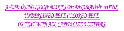
Avoid large blocks of colored text, underlined text, decorative fonts, italicized text, and capitalized letters. Large blocks of these types of text are difficult to read.