When using color to convey information there are several issues to consider to make sure that everyone gets the information regardless of ability.
Color Contrast
Make sure to use adequate contrast between the text and background. WCAG 2.0 requires a contrast ratio of 4.5:1 for normal text and 3:1 for large text. Examples of good and poor contrast are displayed below.

WebAIM provides a color contrast checker to help you select high-contrast color combinations.
Color Blindness/Color Deficient Vision
- Do NOT use color alone to convey meaning (e.g. red text for important content). Use a secondary method, as well, such as italics or bold for text.
- Avoid red and black combinations. People who cannot detect red will confuse red and black, so the item will not be legible.
- Avoid red and green combinations. Approximately 5% of people cannot distinguish between red and green.
- Avoid blue and yellow combinations.
The example below shows an image with red background, a green tree, and a yellow sun. On the left is how a person without color blindness views it. On the right is how it appears to someone with Deuteranopia, a common type of color blindness. As you can see, the green tree and red background are very hard to distinguish.

This color blindness simulator by Color Vision will help you understand how different colors appear to people with different types of color blindness.
Colblindor allows you to upload images and view them as people with various types of color blindness would view them.
Supplement Color Coding
Content should not convey meaning by color alone since learners with low vision or color blindness might have difficulty distinguishing between colors. Use a second method, such as bold or italicized text.
Vibrating Color Combinations
Avoid using brightly colored hues together when placing text on a colored background. When doing so, an “afterimage” is created, which causes the colors to interfere with one another (“visual vibration”).
The image below shows a few examples of “vibrating” color combinations.
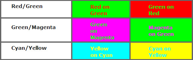
Examples of Vibrating Colors
Textured Backgrounds
Avoid using heavily textured backgrounds since they make text harder to read, as is shown in the example below.